KemeClinic
Multi-role telepsychology SaaS for US clinics
7 min read
- Role
- Solo Product Designer (in-house)
- Timeline
- 2024 — present
- Platform
- Web (Vue) + Mobile (Flutter)
- Status
- Live in production
Designing the architecture, dashboards, and AI workflows for a platform that scaled from a single admin tool to a 4-portal system serving 200+ active users across multiple clinics.
The challenge
KemeClinic started as a single-role admin tool. The team needed to evolve it into a full clinical SaaS — supporting admins, providers, patients, and staff — without rebuilding from scratch or fragmenting the experience.
I joined as the only designer, owned the full product architecture, built the design system from zero, and have been shipping features continuously alongside engineering.
So far, the platform has reached 200+ active users across multiple US clinics, with 4 user portals shipped on web and mobile, a custom design system serving 9 feature areas, and live AI workflows including smart notes, voice control, and AI-assisted diagnoses.
Context
KemeClinic is a US-based telepsychology SaaS that helps mental health clinics manage their entire operation online: appointments, clinical workflows, billing, insurance, and AI-assisted documentation.
When I joined, the product had one role (admin) and a small set of features. The leadership wanted to expand it into a multi-tenant platform that would let any clinic — small private practices to multi-location groups — onboard, customize, and operate independently.
Two product decisions shaped everything I designed afterward:
Four user types, one product
The platform had to support four distinct user types (Admin, Provider, Patient, Staff) without becoming four disconnected products.
Per-clinic customization without engineering
Each clinic had to be able to customize core settings — including which AI environment and model they use — without engineering involvement.
The hero challenge: multi-role architecture
Adding new roles to a product designed for a single user type usually fails in one of two ways.
The first is a unified interface, role-gated. Everyone sees the same shell, but features hide and show based on permissions. This is fast to build but creates two problems: providers see admin clutter, and admins lose the focused workflows they had before.
The second is four separate products under one brand. Each role gets a custom-built interface. This solves the focus problem but triples maintenance cost, fragments the design system, and breaks shared workflows like appointments — where an admin schedules, a provider runs, and a patient joins the same session.
Neither was acceptable. KemeClinic needed something in between.
I designed the architecture around three layers:
Shared spine
Navigation pattern, design tokens, core components (tables, forms, modals, notifications). Identical across all four roles.
Role-specific surfaces
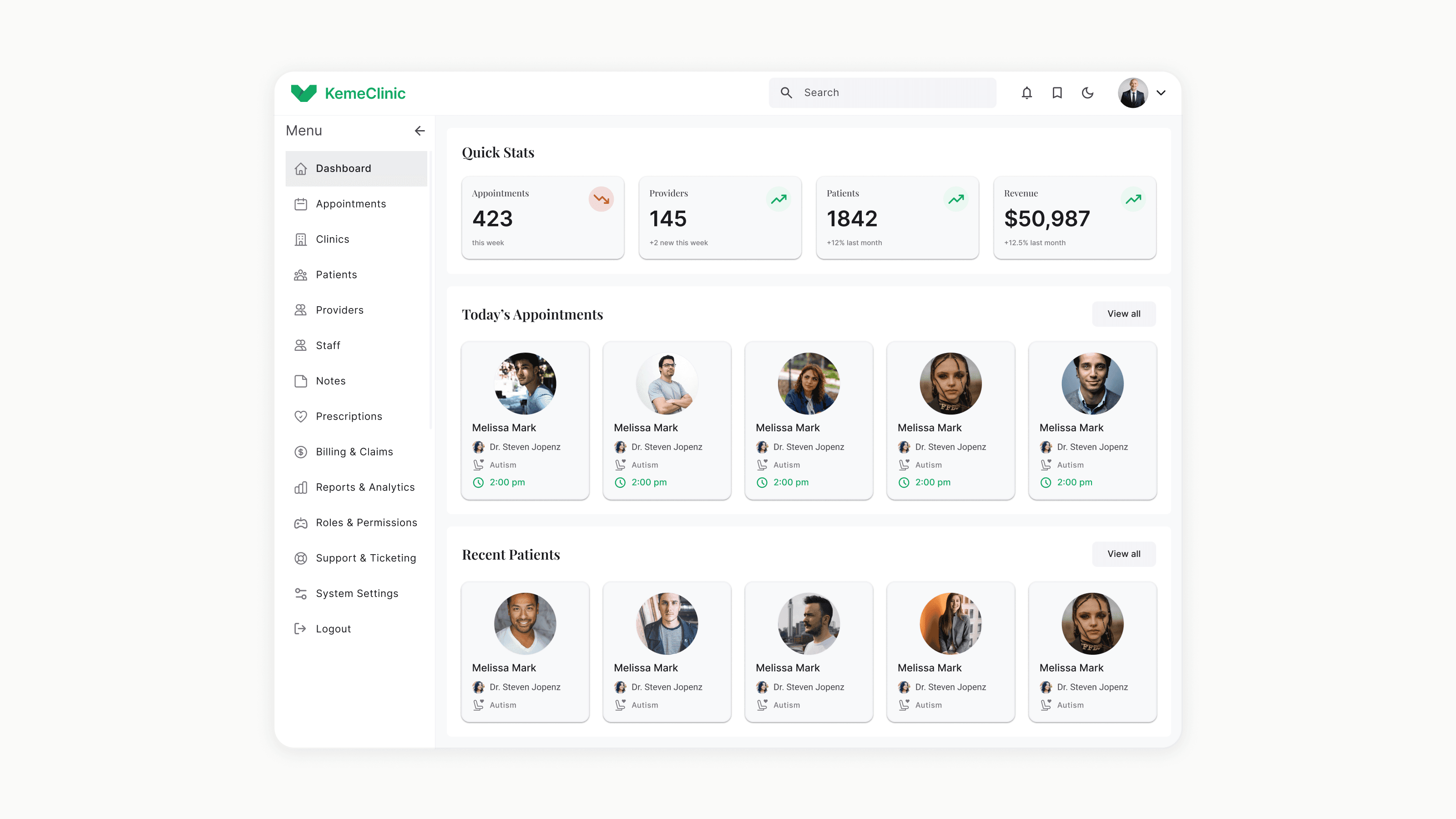
Each role gets its own dashboard, primary tasks, and information density. An admin sees clinic operations; a provider sees today's patients; a patient sees their next appointment.
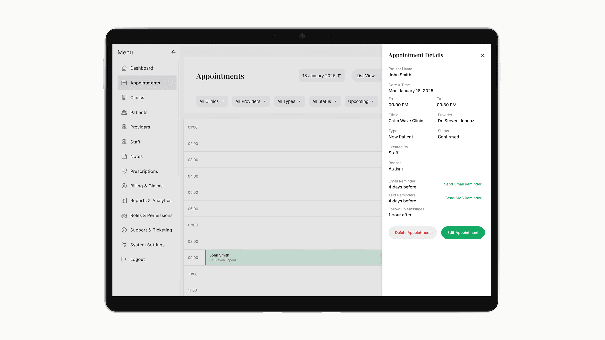
Shared workflows
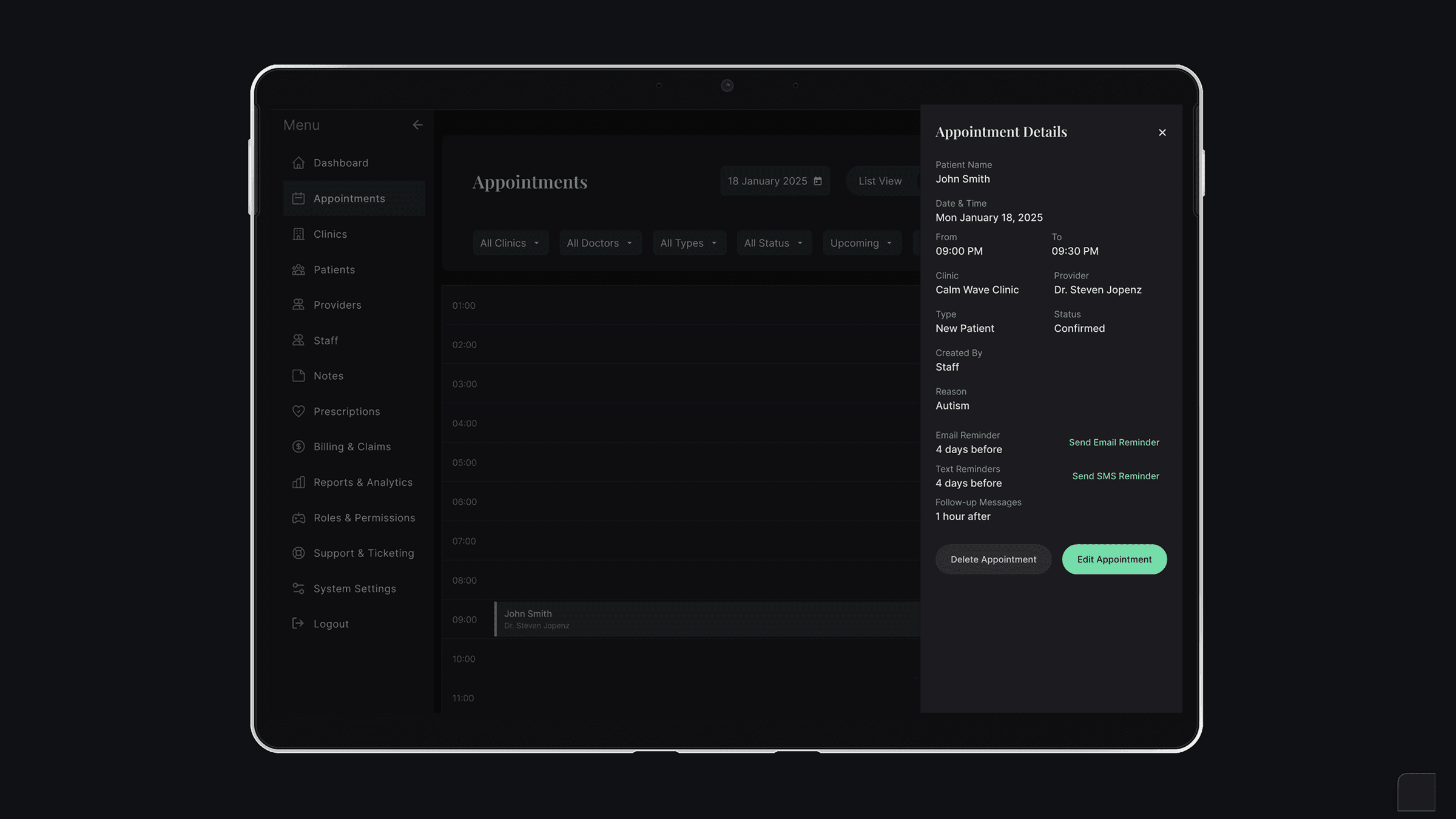
Appointments, messaging, and billing touch multiple roles. These were designed once with role-aware states, not duplicated.
The trade-off I accepted: more upfront design work to define the shared spine carefully, in exchange for a system where adding a new feature once propagates correctly across all four roles instead of being rebuilt four times.
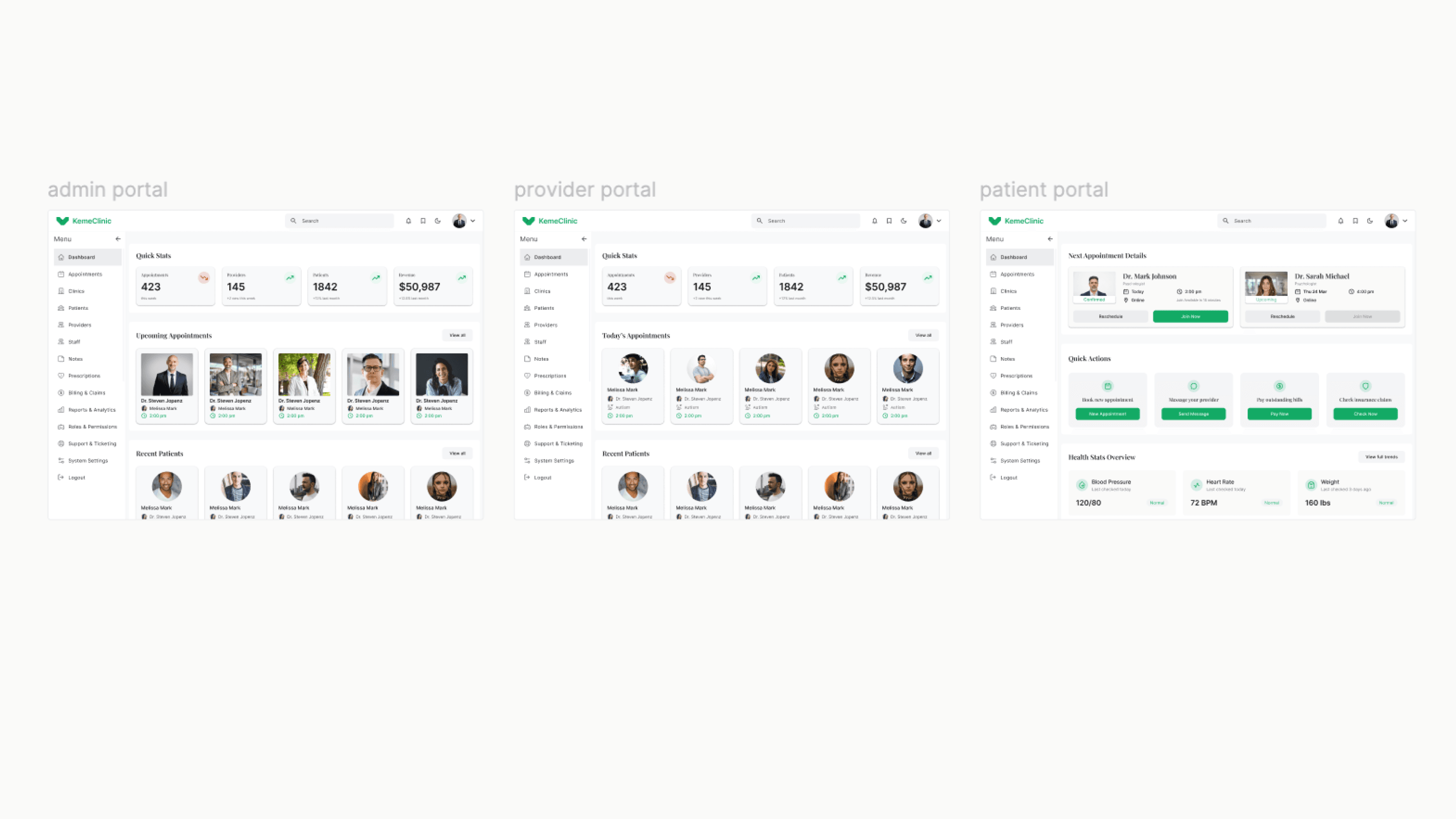
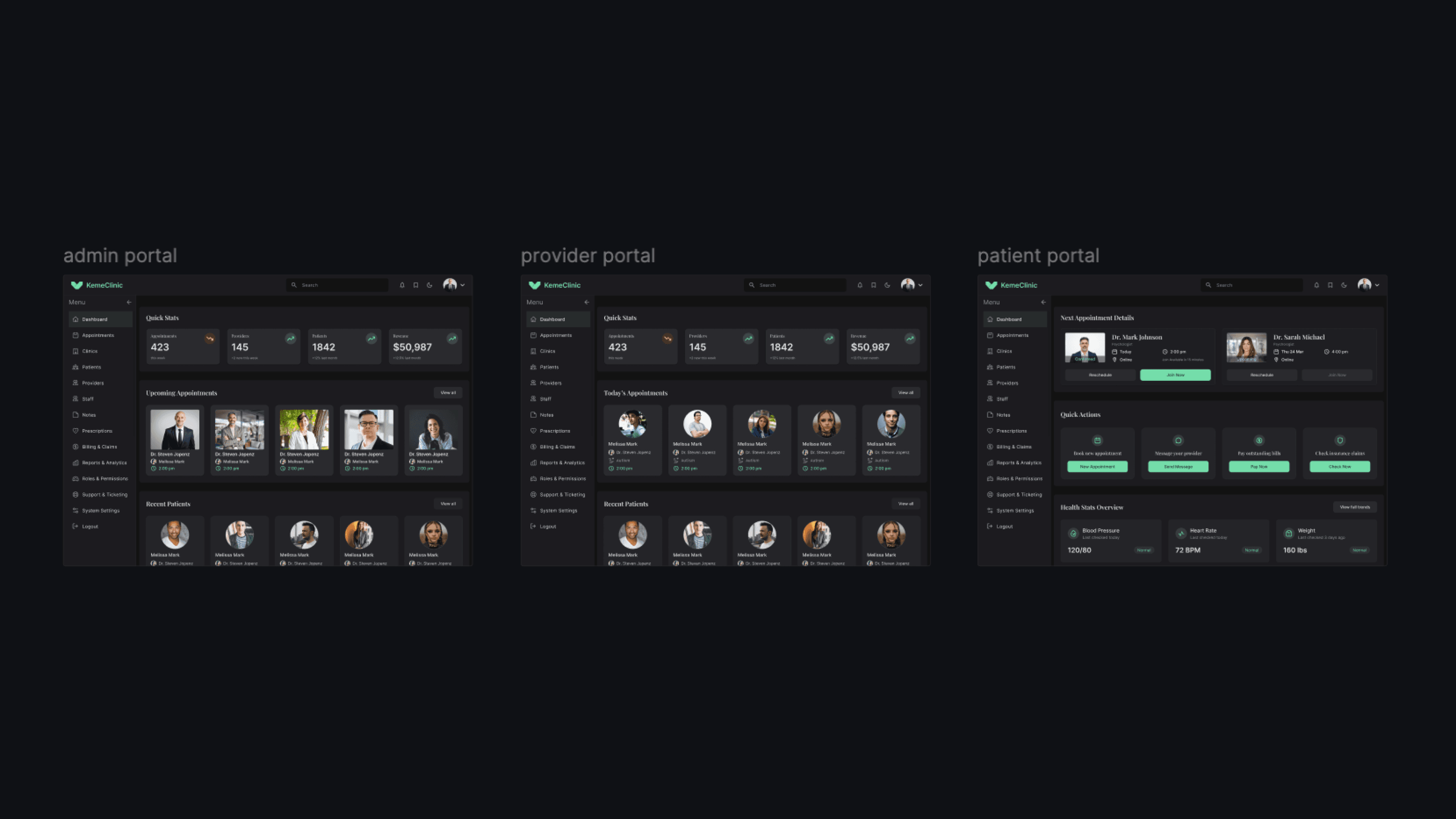
Three layers: shared spine, role-specific surfaces, shared workflows
Designing for providers
Providers (psychiatrists and psychologists) are the most demanding user type in a clinical SaaS for three reasons.
They have the least patience for friction. A provider between sessions has 5-10 minutes. Anything that takes more than 2 clicks to find gets abandoned.
They need to switch between high-focus and high-context modes constantly. During a session: clinical notes, focused. Between sessions: schedule, patient history, billing — broad context.
They use AI features that don't have established UX patterns yet. Smart notes, voice control, and AI-assisted diagnoses are new categories. There's no Material Design pattern to copy.
A two-mode dashboard
The Provider home defaults to "today" — only what's needed for the current day. A single toggle expands to a weekly planning view. This kept the high-focus mode clean without hiding the broader context.
AI features as inline assistants, not standalone tools
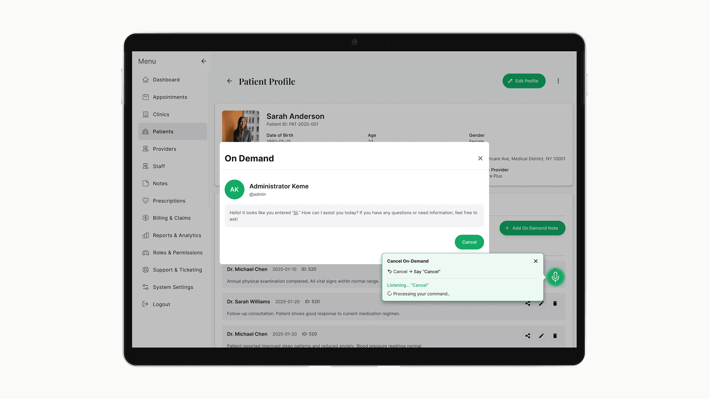
Smart notes don't live in a separate screen. They appear inside the session note editor, suggested as the provider types. Voice control is activated from within the active session, not from a global menu. The AI is positioned as augmenting the provider's existing workflow — not as a separate product they have to learn.
Diagnoses with explainability, not automation
AI-assisted diagnoses surface suggestions with the reasoning visible — which symptoms or notes triggered the suggestion. The provider always confirms or rejects. This was the most debated decision internally — some wanted full automation. I pushed back because in a clinical context, an unexplainable AI suggestion is a liability, not a feature.
Provider home defaults to today's sessions

AI lives inside the workflow, not next to it
Building the design system from zero
The team considered Material and Ant Design as starting points. Both had problems for this product.
Material is opinionated toward consumer apps. Healthcare workflows need denser tables, more decisive states, and stricter accessibility than Material defaults provide.
Ant Design has the density we needed but visually reads as enterprise admin tools — not the right tone for a clinical product where patients also log in.
I built the system on top of Tailwind with a custom config — keeping the engineering speed of utility-first CSS while owning the visual language end-to-end.
The system includes design tokens with semantic naming (colors, spacing, typography, elevation, motion), 40+ components across forms, tables, navigation, feedback, and data display, standardized patterns for empty states, loading states, error states, and confirmation flows, and accessibility commitments including WCAG AA contrast across all states, full keyboard navigation, and screen reader labels.
Each feature area (appointments, clinic management, billing, etc.) was designed using the same component vocabulary. When a new feature is added — like the recent voice control — I extend the system instead of inventing new patterns. This is why the product still feels coherent despite scope tripling since launch.
What I'd do differently
Version the design system from day one
The system grew faster than my documentation. When a new engineer joined, onboarding took longer than it should have because component history wasn't tracked. Next time, I'd version components in Figma from the first commit.
Run usability tests on the Provider role earlier
I designed the first Provider portal based on stakeholder input and clinical research. It worked — but two months in, I learned providers used three workflows I hadn't prioritized. Earlier sessions with actual providers would have caught this.
Push harder on AI explainability standards
The diagnosis feature has explainability built in, but smart notes don't yet show why a suggestion was made. I should have argued for consistency across all AI features, not just the highest-stakes one.
Status
Currently live in production with 200+ active users across multiple US clinics. Active development continues — recent additions include voice control for clinical notes and expanded billing/insurance workflows.
Specific clinic names and detailed metrics are confidential. Available to discuss in interviews.