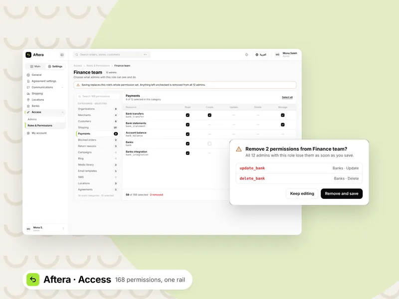
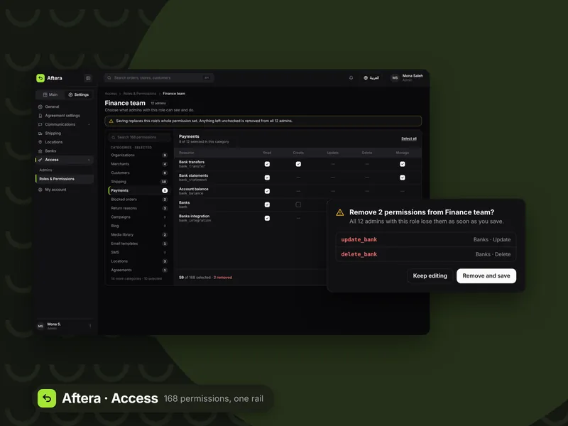
Aftera
Aftera is a web platform that runs returns and exchanges for online stores in Saudi Arabia, and works with e-commerce platforms like Salla, Zid and Shopify. It has three portals: admin, merchant and customer. This case study is about the admin portal, the largest one, because it brings stores, shipping, payments and permissions into one place.
- Role
- UI/UX designer
- Platform
- Web, Arabic and English
- Status
- Live in Saudi Arabia
One design system, two languages
The design system was English only, and Arabic mattered most to the company. I added an Arabic version of every component, and designed new components when the screens needed them. I wrote the Arabic terms myself and kept them in one glossary the team works from.
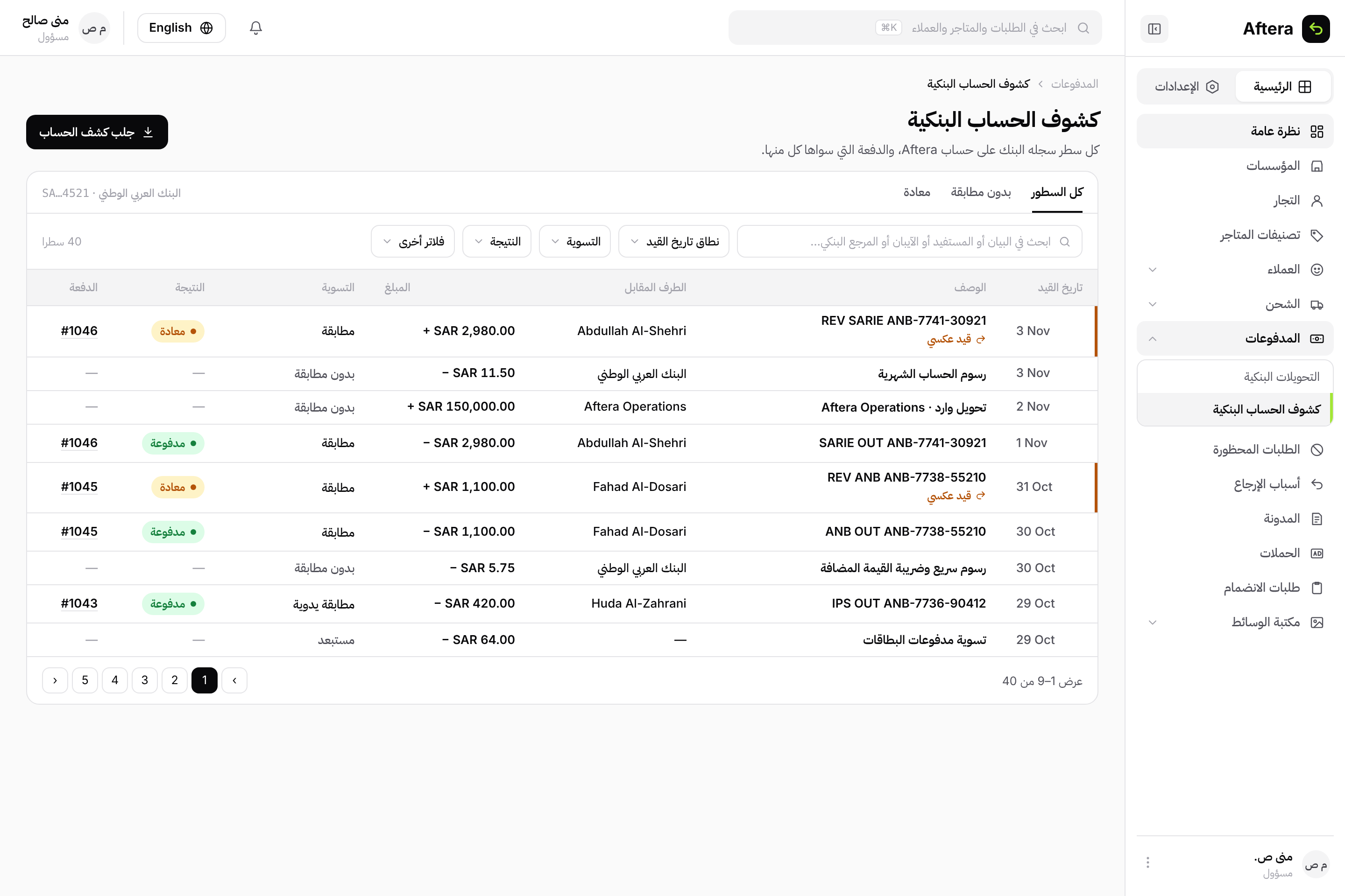
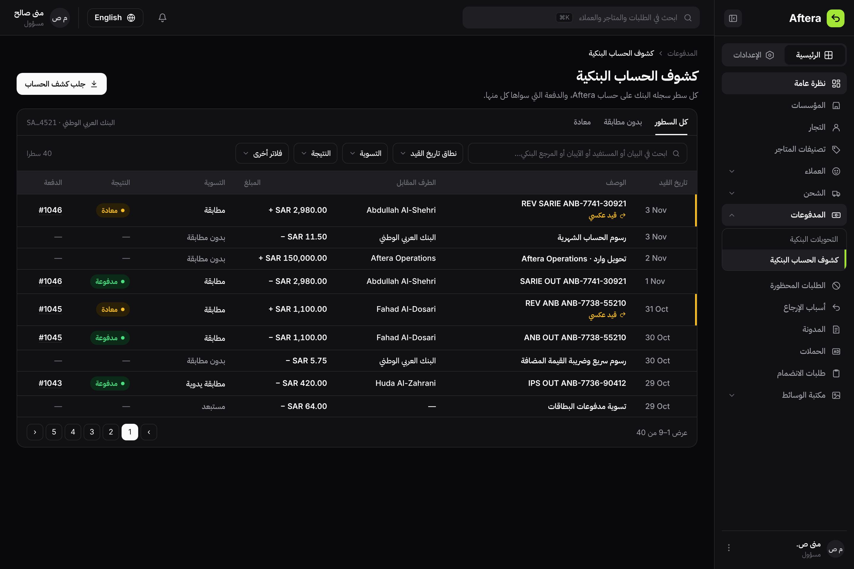
The same screen in Arabic, with the settled terms for post date, counterparty, reconciliation and reversal.
One sidebar for every portal
I designed the sidebar for all three portals from the product architecture. One section for daily work, one for settings. In the first build the collapse button disappeared over the content, so I moved it next to the logo.
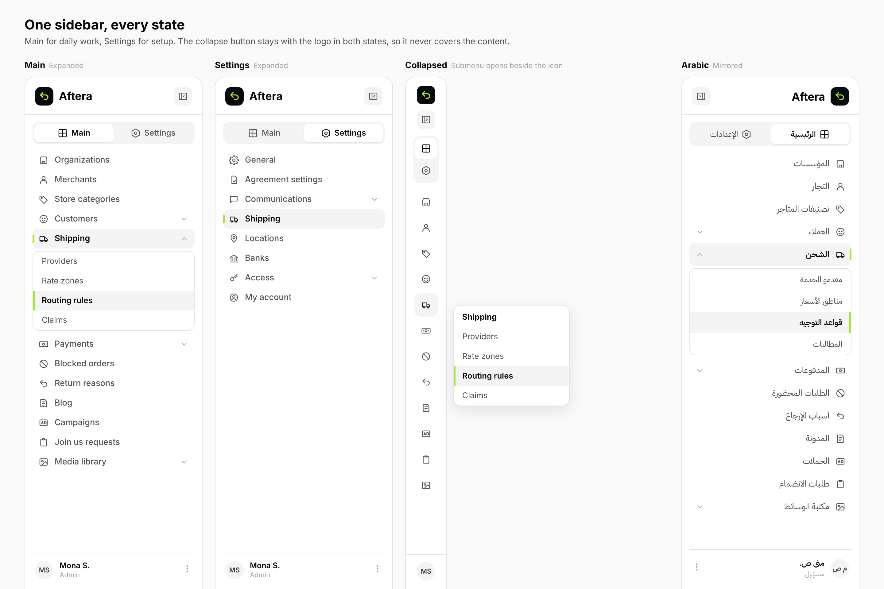
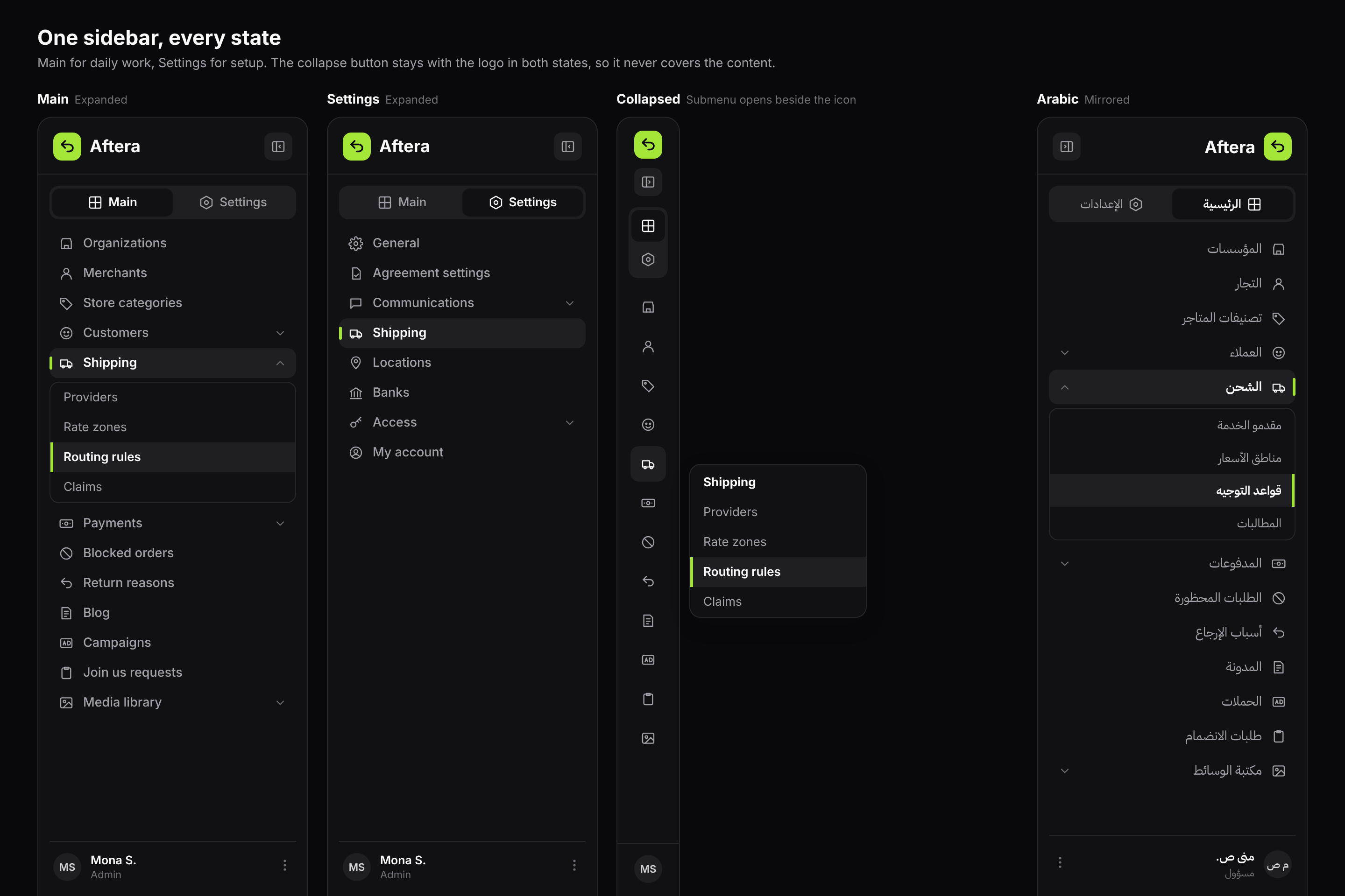
Expanded, settings, collapsed with a submenu beside the icon, and Arabic.
Organization page
An organization is the account that holds a merchant's stores. The store selector sits at the top, with tabs below for everything about that store: products, orders, returns, customers, subscriptions and the ledger.
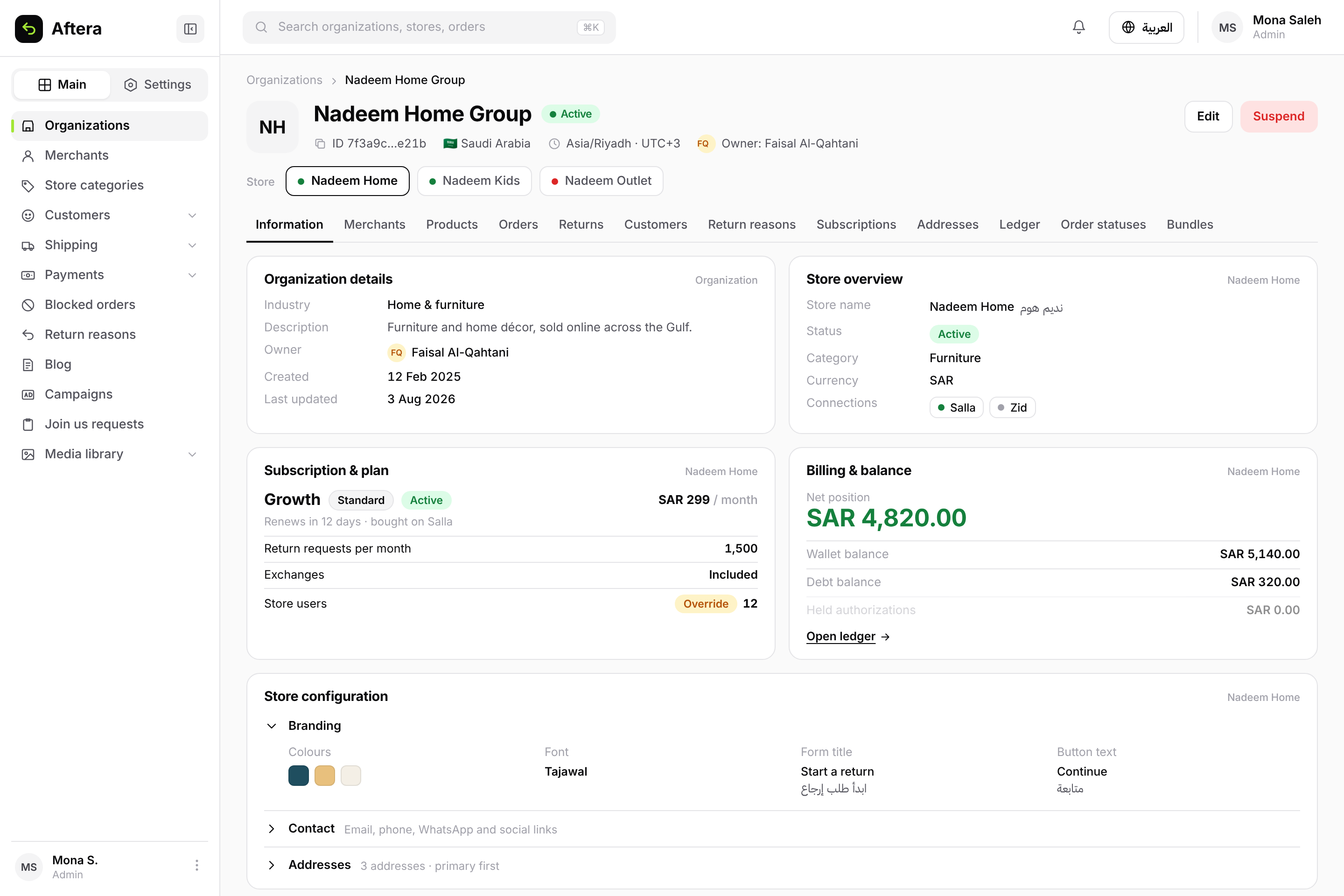
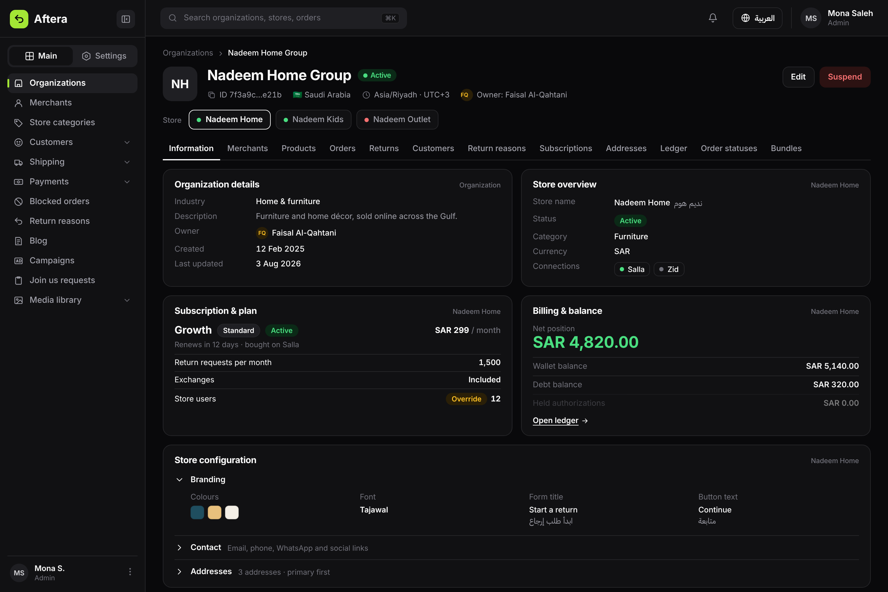
Store selector, 12 tabs, and the information tab.
A suggested overview
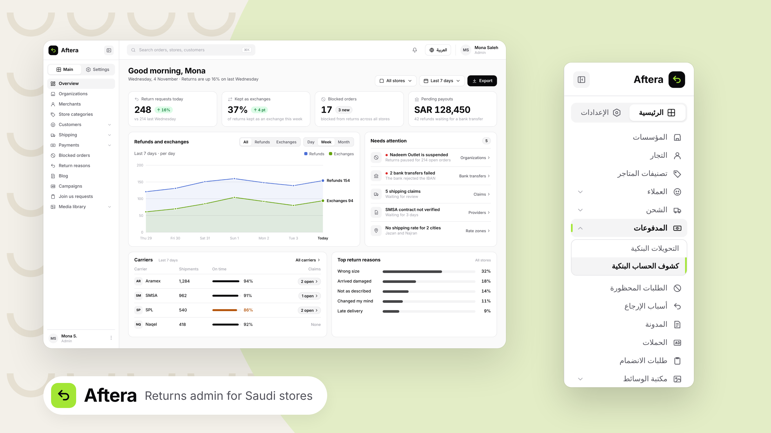
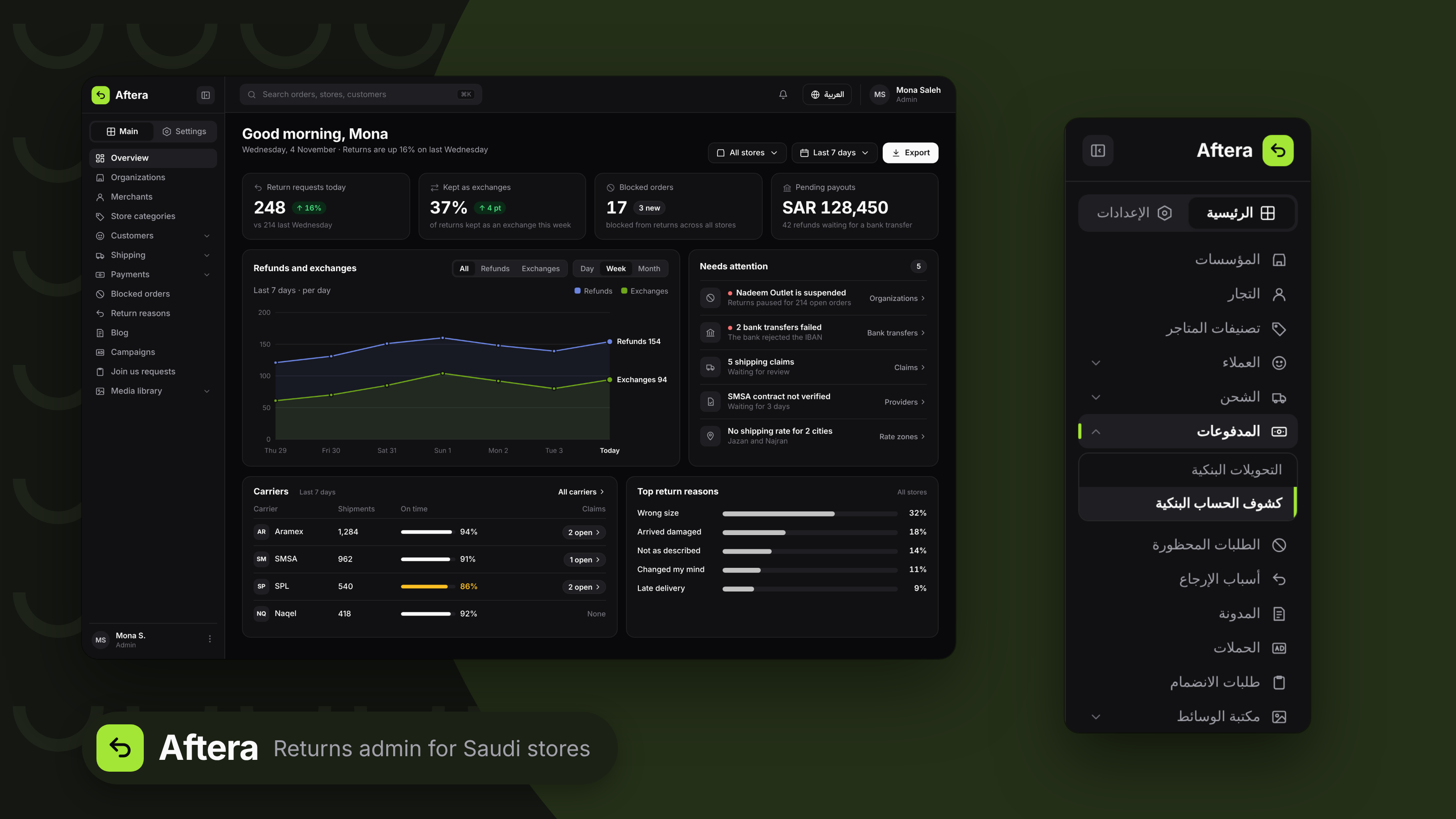
The admin had no home page in the product. This is a suggested concept, built from the product's real modules. Every number shows its change and one line that explains it, and the "Needs attention" list takes the admin to the right page instead of acting from the dashboard.
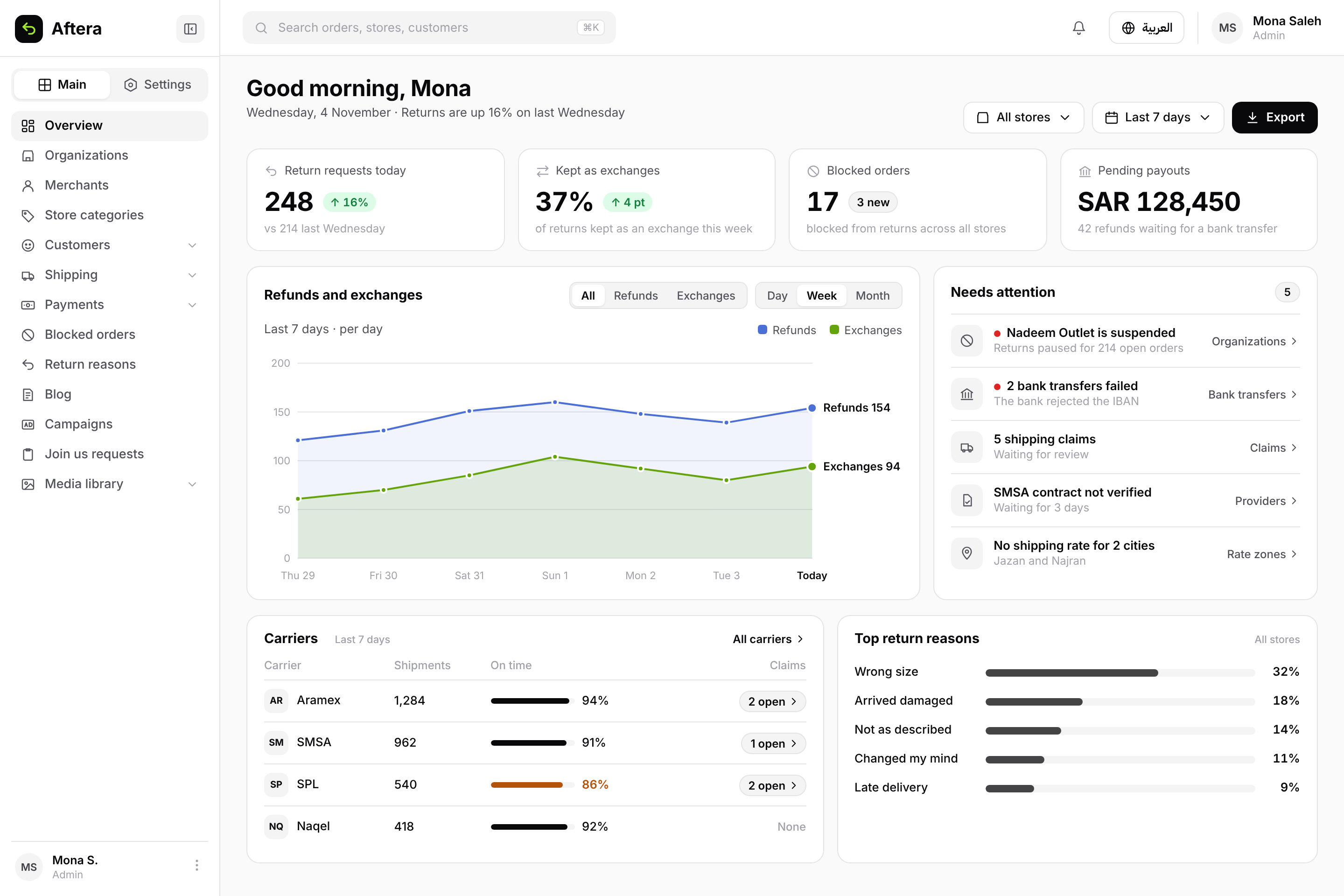
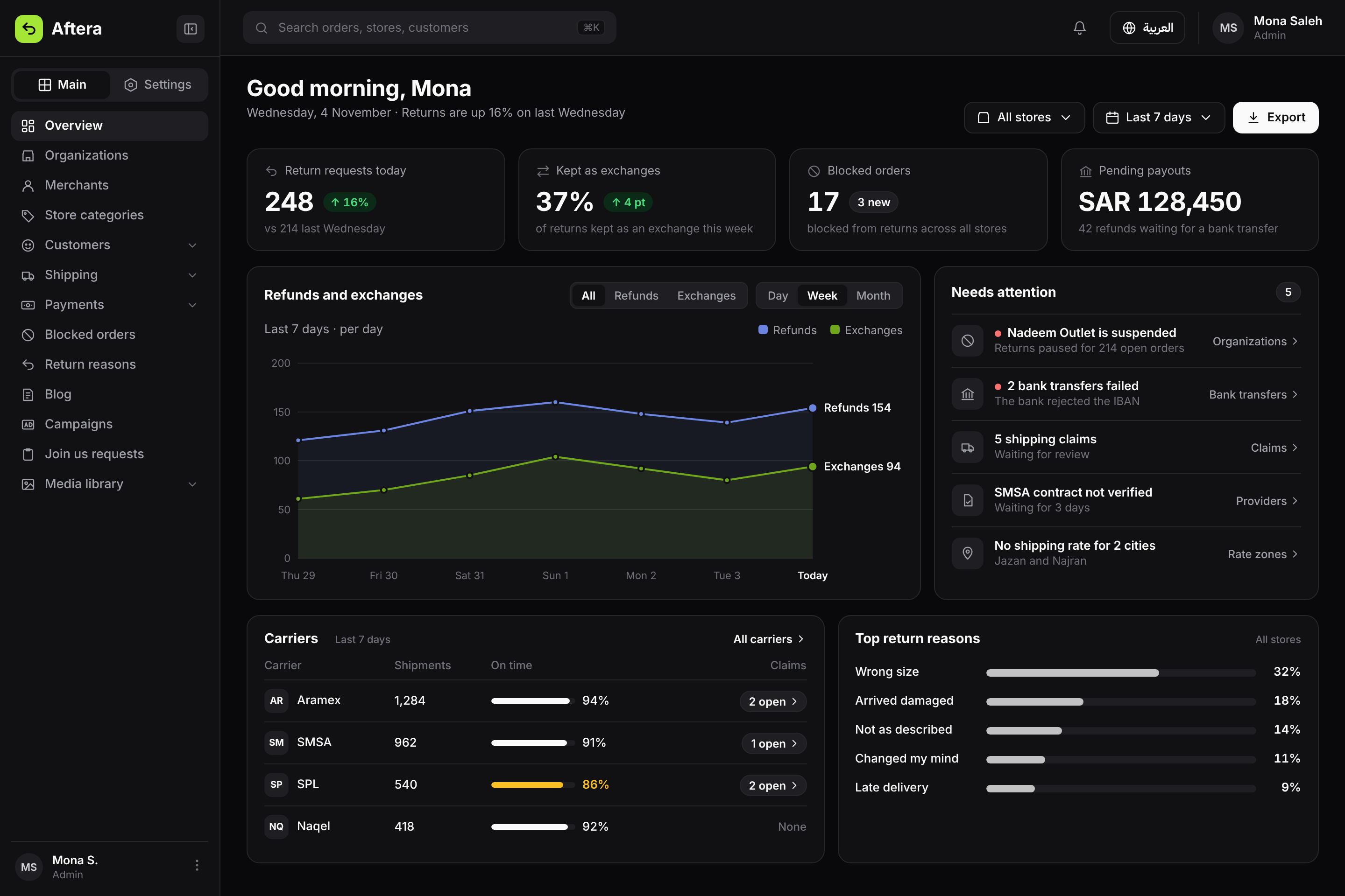
Concept: today's return requests, exchanges, what needs attention, and carrier performance.
How I worked
I read the technical requirements shared with me, frontend and backend, then met with them to confirm every API the screen needed existed. Then I used AI tools to write the design brief and build the screens.
I reviewed and approved every screen, and checked it was built from design system components. When a gap came up I logged it, and no new component went in before approval. At the end I reviewed what frontend built against the design, and left my comments before the task moved to ready.
What I learned
A good screen starts before the design, with alignment between the design system, the business requirements, the technical requirements, the API docs and what the feature really needs. Sometimes I asked to change the document itself, then backend updated the task, then frontend built it.