Payments
I grouped everything financial into one section: bank transfers and bank statements. Transfers send real money from the company's account to an IBAN someone typed. Statements send nothing; their job is matching. Every decision on both screens started from that difference.
Bank transfers
Colour says the outcome, the word says the status. Blue is for no outcome yet, grey for what an admin stopped, and amber only for money that came back. A recreated payment shows its link on both rows, so it doesn't read as two payments to the same IBAN for the same amount. At the top is the balance of the account the money leaves, with the account number masked.
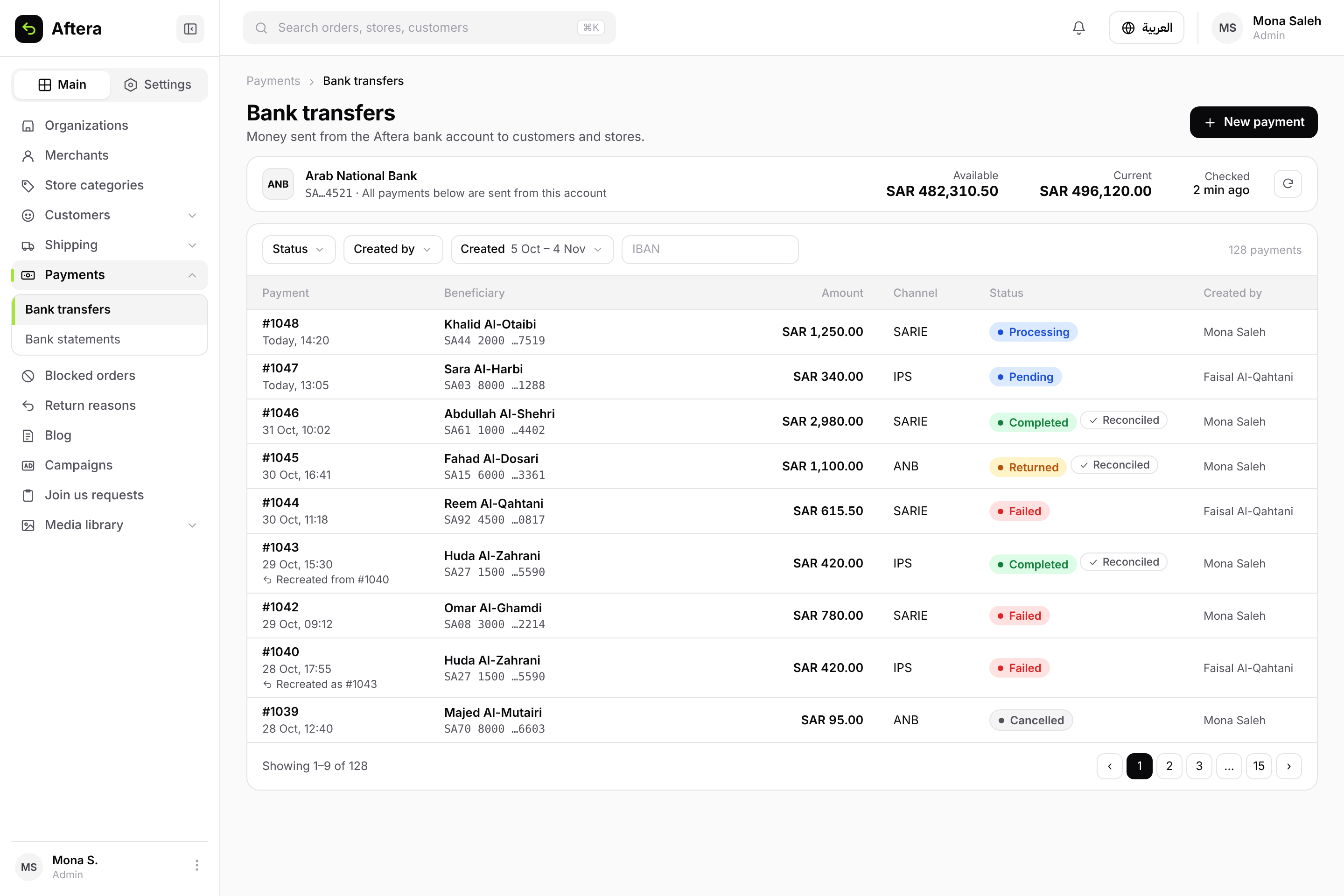
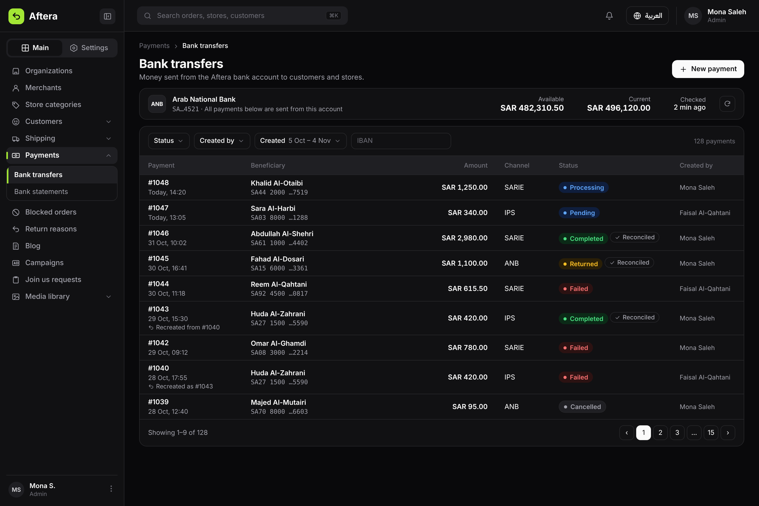
The balance, six statuses, and a new payment linked to the one that failed.
Completed, and the money came back
The riskiest case in the module: the payment is marked completed, but the bank returned the amount later. So the returned-funds message is clearer than the green status, with the two statement lines below it: the debit, then the reversal. Beside it are the payment's steps, from creation to the money coming back.
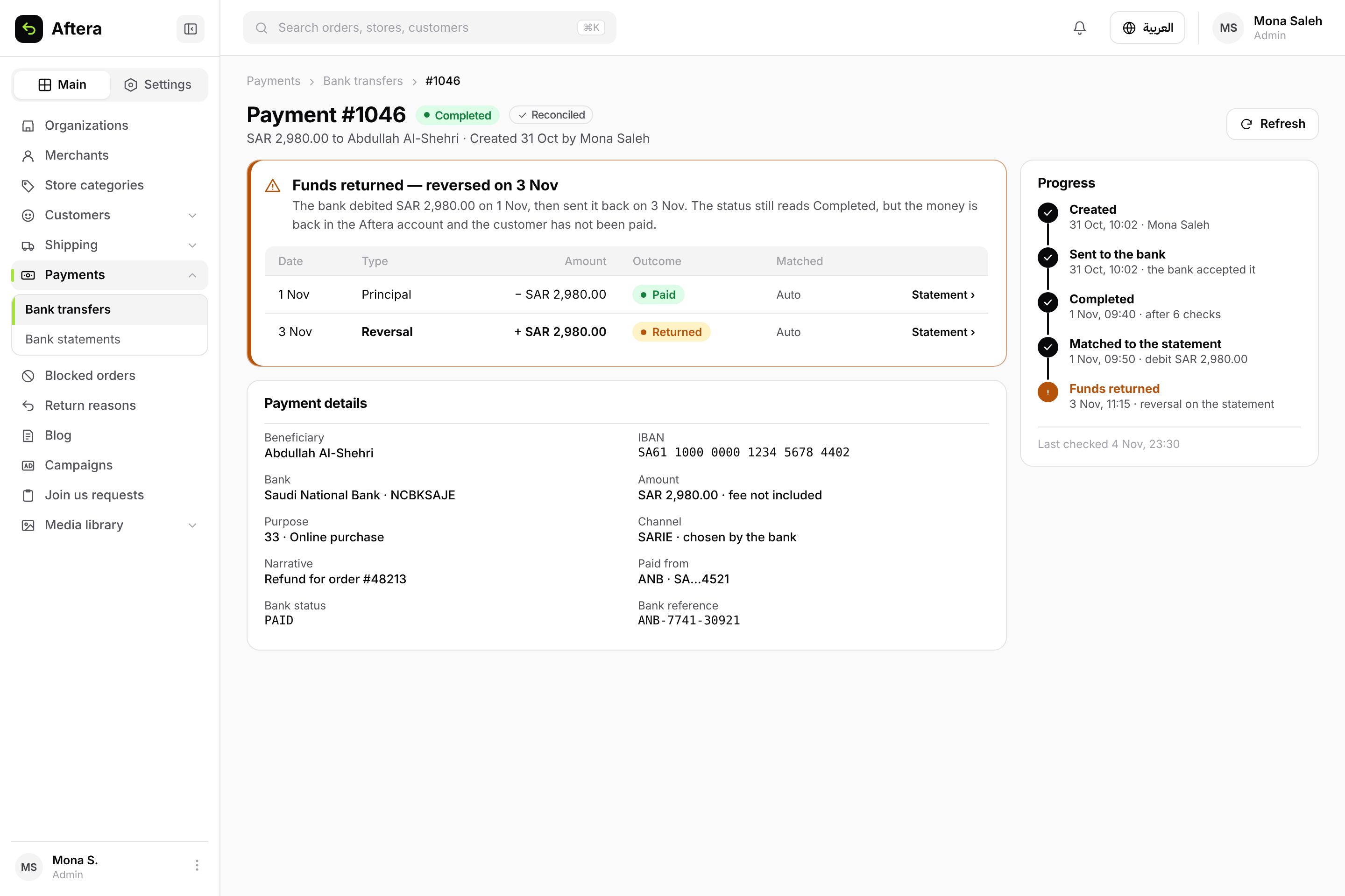
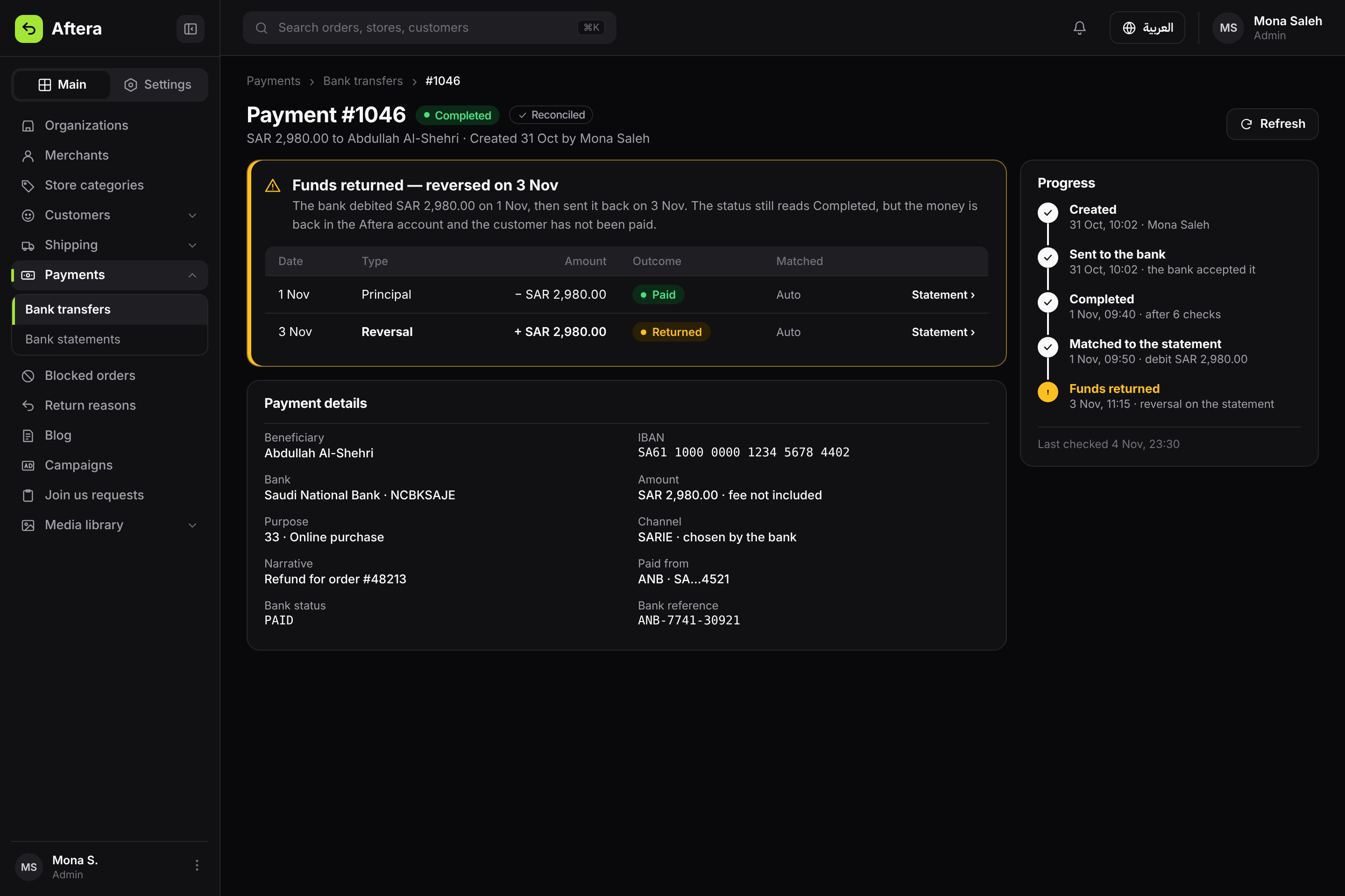
The status says completed, and the returned-funds message is the clearest thing on the page.
Bank statements
Every line the bank posted, and the payment it settled. One colour per row, for the outcome, because three green marks side by side with different meanings tell nothing apart. Unmatched lines are quiet, because most are normal fees or deposits. A reversal has its own mark, because it is what the finance team looks for most.
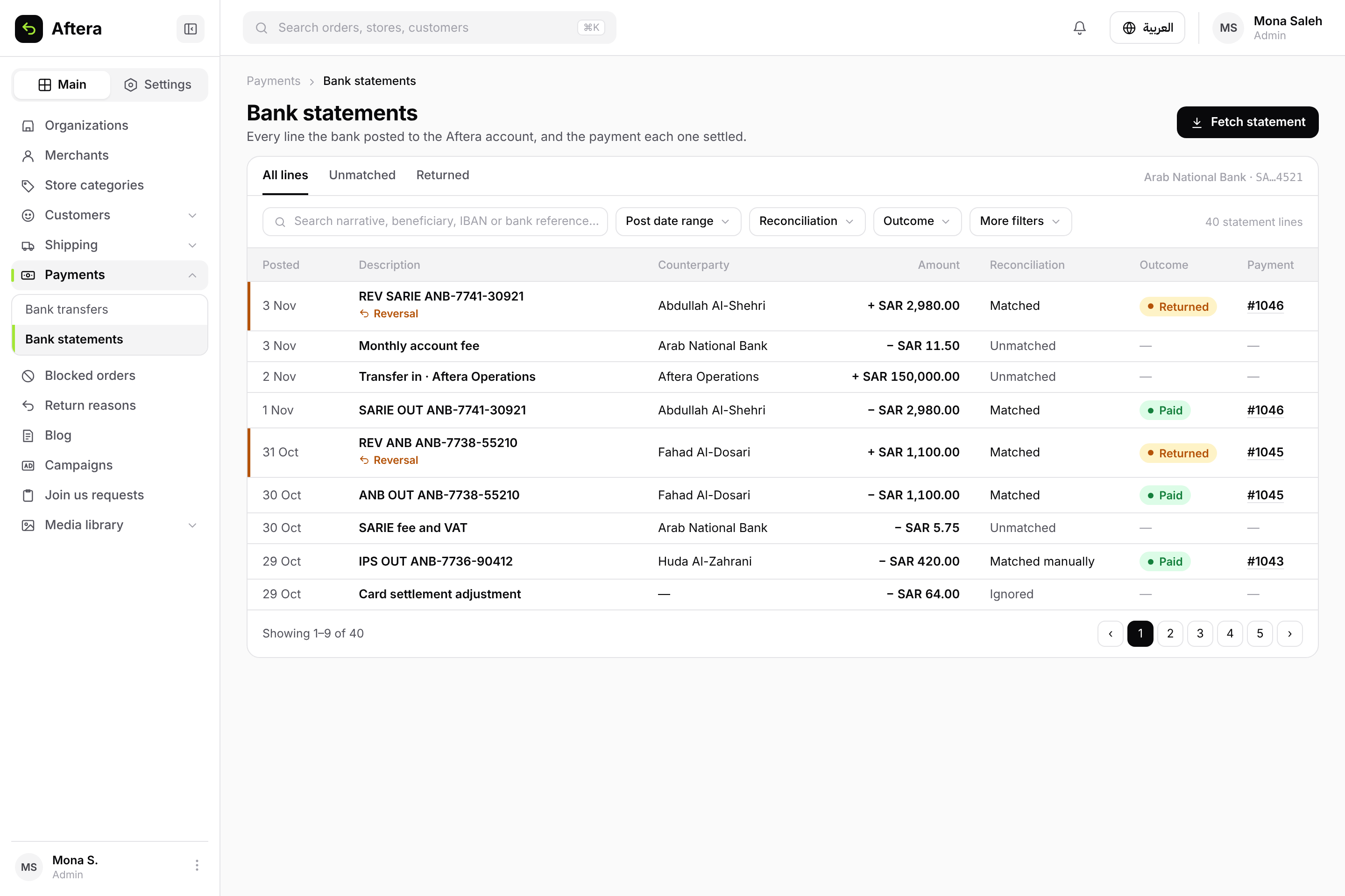
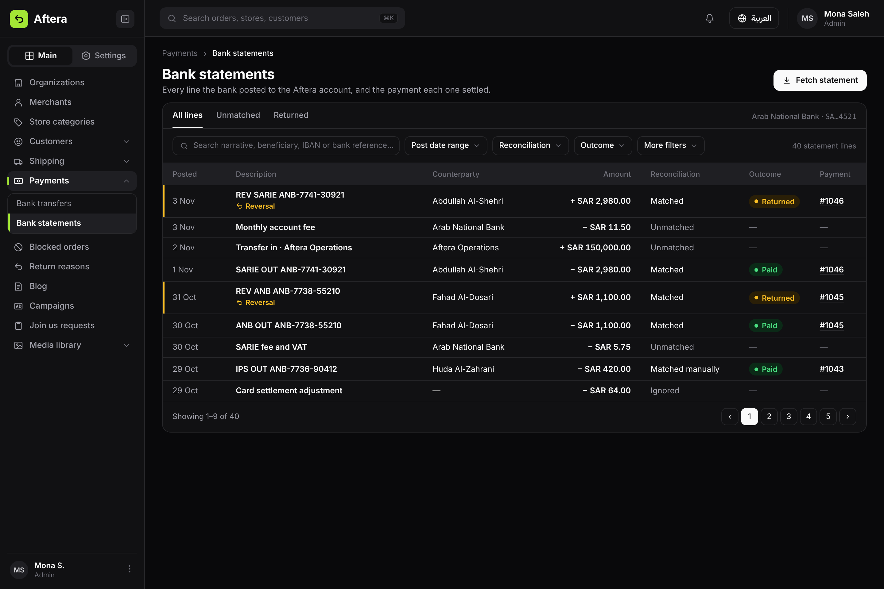
All lines, unmatched, and returned. The search says what it searches.
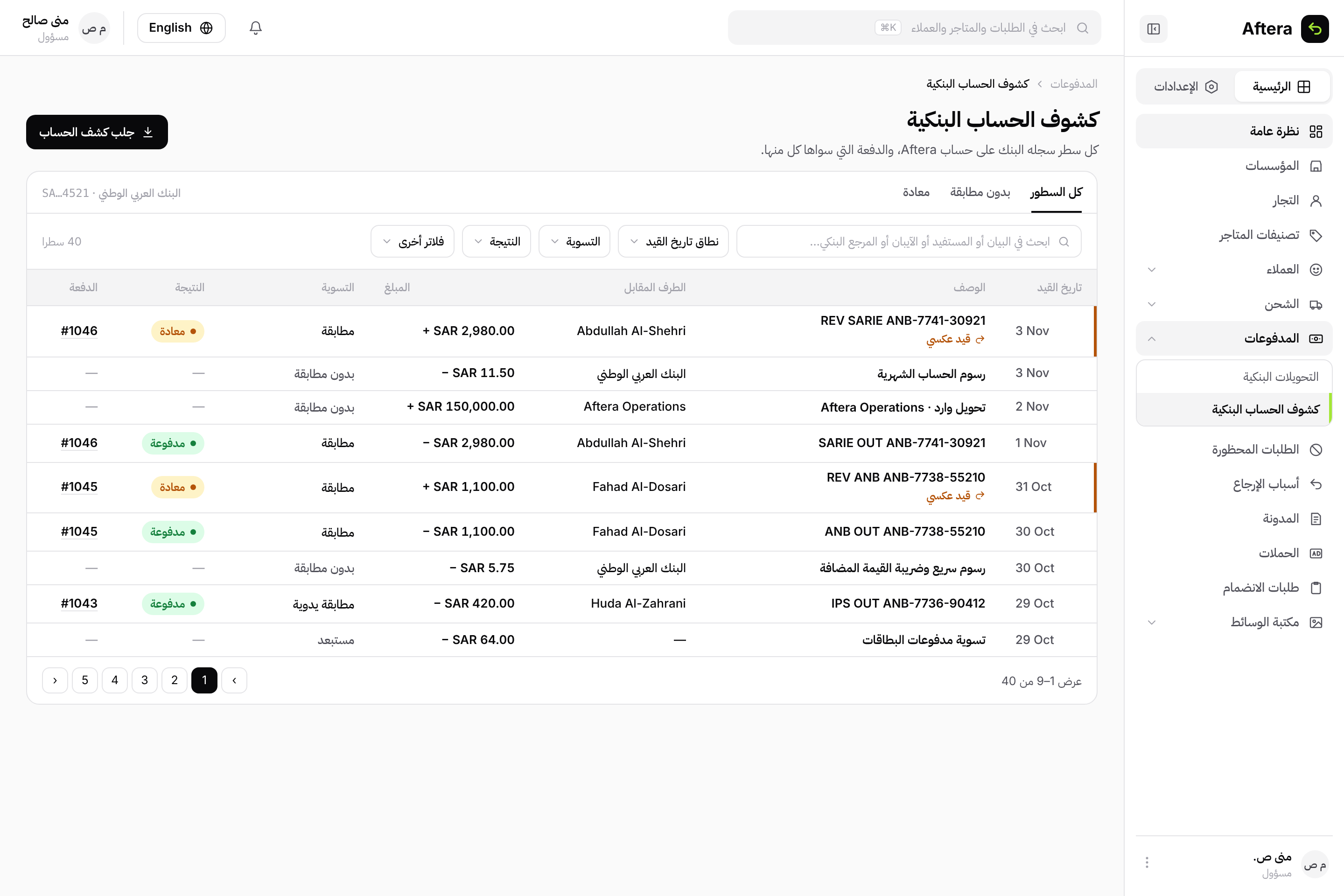
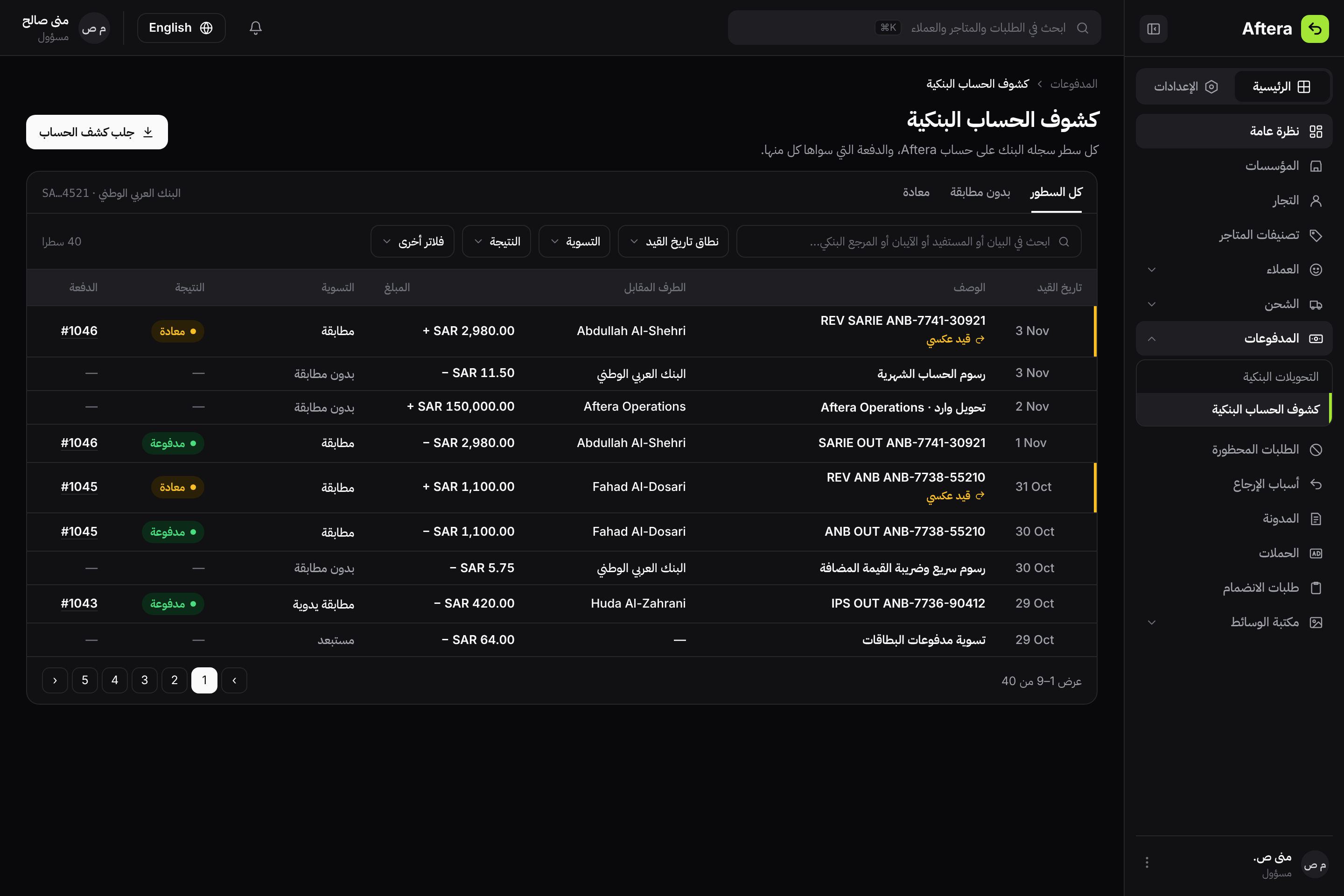
The same screen in Arabic, with Western numerals for numbers and dates in both languages.